Angular Navigation and Routing
Angular single page applications can use the Router extension to give the appearance of multiple pages but without additional HTTP get requests being sent.

Adding a navigation bar using bootstrap styles is easy, but how do we make the contents of the app change without having to hit the server. After all, this is supposed to be a single page application, isn’t it? Won’t a nav button make a call back to the server?
No problem at all. We can use the Angular routing functionality to tell the application to show a component whenever a particular button on the nav bar is clicked without making a HTTP get request. Angular will select the correct sub component to show in the space we allocate to routing.
Bootstrap Nav Bar
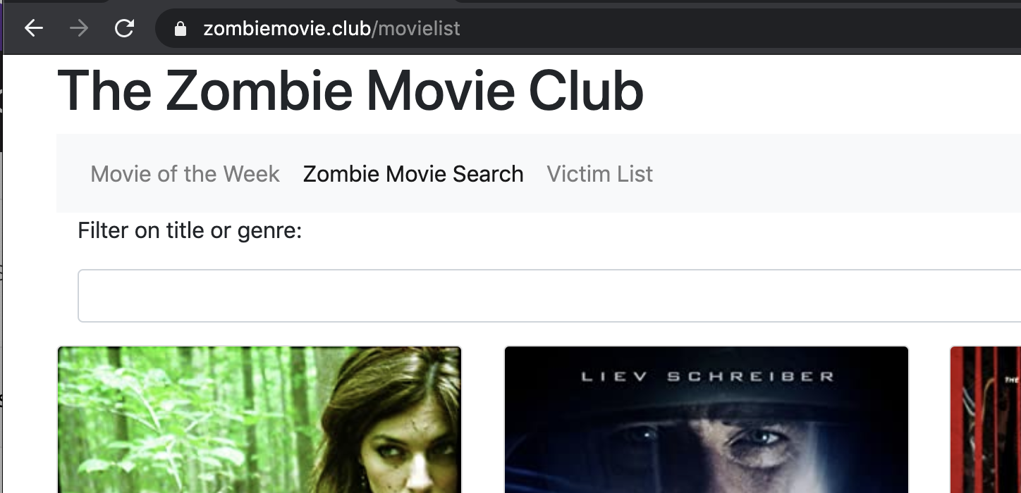
First thing is to add the simplest of navigation bars to the application. For now, there will only be three views available. The movie list is something we have already seen (see post under this tag for details.) The other pages will be a movie of the week page that shows the selected movie that my friends and I have chosen that week, and finally, there will be a page to show past movies of the week.

First create the nav bar component with ng generate component nav-bar, which will generate the required files and add it to the declarations in app.js. To add the component to the page we simply place <app-nav-bar></app-nav-bar> in the main template app.component.html and change the contents of the new file nav-bar.component.html to be:
<nav class="navbar navbar-expand-lg navbar-light bg-light">
  <button class="navbar-toggler" type="button" data-toggle="collapse" data-target="#navbarSupportedContent" aria-controls="navbarSupportedContent" aria-expanded="false" aria-label="Toggle navigation">
    <span class="navbar-toggler-icon"></span>
  </button>
  <div class="collapse navbar-collapse" id="navbarSupportedContent">
    <ul class="navbar-nav mr-auto">
      <li class="nav-item active">
        <a class="nav-link" href="#">Movie of the Week <span class="sr-only">(current)</span></a>
      </li>
      <li class="nav-item">
        <a class="nav-link" href="#">Zombie Movie Search</a>
      </li>
      <li class="nav-item">
        <a class="nav-link" href="#" data-toggle="tooltip" title="See what we have been watching recently">Victim List</a>
      </li>
    </ul>
  </div>
</nav>
This is boiler plate bootstrap code that will create a responsive navigation bar on the page. When the screen is narrow, such as on a phone or tablet, the nav bar will collapse into a hamburger button which must be clicked or pressed to see the links. At the moment, none of the buttons do anything.
Adding Routing
You can place the routing code into the app.component.ts but I’d prefer to keep that as a declarative section only. Instead I’m going to create a new component at the same level to hold the routing configuration. This will be its own module, not a component, as there is nothing to show on screen.
ng generate module app-routing --flat --module=app
The module option is specified to ensure that the new module is registered with our app; the default is not to do so. The flat option causes the new file to be added at the same level as the main app rather than in its own folder.
Firstly we are going to need to import a few things. We will need use RouterModule and Routes from the Angular routing module. Also the pages that need to be routed must be imported here.
import { RouterModule, Routes } from '@angular/router';
import { MovieoftheweekComponent } from './movieoftheweek/movieoftheweek.component';
import { MovieListComponent } from './movie-list/movie-list.component';
import { PastSelectionsComponent } from './past-selections/past-selections.component';
The routes themselves are declared in a list. Each has the path that will be acted on and a component to show. For example, the root of the website, the.zombiemovie.club/ will show the Movie of the Week as the landing page.
const routes: Routes = [
  { path: '', component: MovieoftheweekComponent },
  { path: 'movielist', component: MovieListComponent },
  { path: 'pastselections', component: PastSelectionsComponent }
];
The last thing to add to app-routing.module.ts uses RouterModule to register the routes that we have defined above.
@NgModule({
  imports: [RouterModule.forRoot(routes)],
  exports: [RouterModule]
})
export class AppRoutingModule { }
To show the correct content for each route on the main section of the app, we need to add a special Angular tag, router-outlet, to the body of the website. The contents of app.component.html becomes:
<div class="container">
  <h1>The Zombie Movie Club</h1>
  <app-nav-bar></app-nav-bar>
  <div>
    <router-outlet></router-outlet>
  </div>
</div>
This won’t do much as it is – the nav bar buttons are not working yet. We need to revisit nav-bar.component.html and change it to use the new addresses.
The Clever Stuff
This is where Angular does something smart. Rather than use the href parameter for the links, which would cause the browser to reach out to the website again, Angular provides a different attribute, routerLink, which makes the app use its internal routing instead.
Everything looks like a normal link click to the user as the new page loads, but under the hood, the routing is figuring out what content should appear in the router-outlet block.
Before showing the code, I’ll mention two other useful attributes here. We need to change the class of each nav bar button when each is pressed so that it shows which page you are on. We can do this with the routerLinkActive attribute. It we set the class to include whatever its value is when that router link is the active one.
However, because the root path, /, is always active, we need to refine this for the home page. We can use [routerLinkActiveOptions]="{exact: true}", which passes a JavaScript object which will force an exact match for the URL in the case of the root page. Here is the links section of the nav bar now.
<li class="nav-item" routerLinkActive="active" [routerLinkActiveOptions]="{exact: true}">
	<a class="nav-link" routerLink="/">Movie of the Week <span class="sr-only">(current)</span></a>
</li>
<li class="nav-item" routerLinkActive="active">
	<a class="nav-link" routerLink="/movielist">Zombie Movie Search</a>
</li>
<li class="nav-item" routerLinkActive="active">
	<a class="nav-link" routerLink="/pastselections" data-toggle="tooltip" title="See what we have been watching recently">Victim List</a>
</li>
If you click around the three pages, you can verify that the browser is not going out to the internet for each change of page. Everything the app needs is loaded in one quick request.

